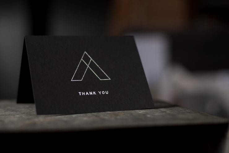
Understanding the Difference Between Letterpress and Other Print Methods

You’re ready to get something printed, but unless you have been in the printing business, the wide array of choice for the exact printing type you want or need can be confusing. However, the type of printing you choose can have a significant impact on how satisfied you are…

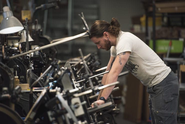
How to Design Unique Letterpress Business Cards

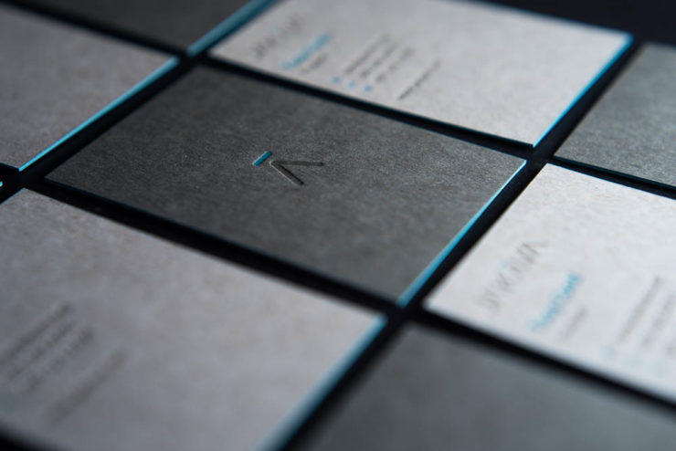
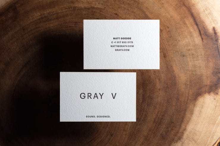
For making a powerful and memorable impression, nothing tops letterpress business cards.

By itself, this venerable printing method – which has been used since the 15th century – speaks volumes about who you are and what you have to offer. But, when you combine letterpress printing with great design, your business cards will truly stand out for anyone who sees or holds one in their hand.

So how do you go about designing a custom business card that is as unique as you are? Today, the design team at The Mandate Press shares some of our best pro tips with you.

Think About What You Want to Convey

The first step to creating a unique business card design is to look beyond the obvious.

Sure, you know your cards need to have your name, your contact information, etc., but what do you really want them to say, from a design perspective. Fonts, graphics, paper or cardstock, ink colors, embellishments, etc., all speak volumes as compared to the letters and numbers your cards will include.

Even the way your cards lay out is important. Landscape or portrait orientation? Do you want a logo or graphic of some type? If so, where does it go and how large should it be? You want your cards to tell the world who you are and what you stand for. This will make them read the phone number or email address and reach out.

Remember That Less Is More in Custom Business Card Design

As tempting as it might be to fill up your card design with pertinent info, stick with the KISS principle and Keep It Simple, Stupid.

The power of white space (those areas without printing) not only makes your card easier to read but it sets a clear tone and directs the viewer’s focus where you want it to go. Whether you want to convey a tone that suggests luxury, artsy, modern, understated, etc., the way your design lays out makes that possible.

Identify the absolute minimum information you can get by with on your card and don’t be tempted to overshare.

Check out our custom letterpress printing portfolio for some great examples of how powerful a clean, simple design can be.

Find a Letterpress Business Card Printer Who Gets You

Unless you’re a legit graphic designer, it’s probably safe to say that you don’t have the full “secret sauce” recipe for outstanding letterpress printing design – nor do you need to, if you work with a print studio that does.

Small, locally owned letterpress printers – like The Mandate Press – approach every design and print job with the diligence and care of a true craftsperson. So much so, in fact, that you can pick up the phone and chat about what might work best.

Our team can assist you as much or as little with your design as you’d like, including layout, paper selection, ink colors and more. Or, if you’d like something a little more simple – yet just as impactful – check out our custom business and calling card templates.

When making the best possible impression matters, call on The Mandate Press for help with your custom letterpress business cards.

Prints & Pints: Art + Works

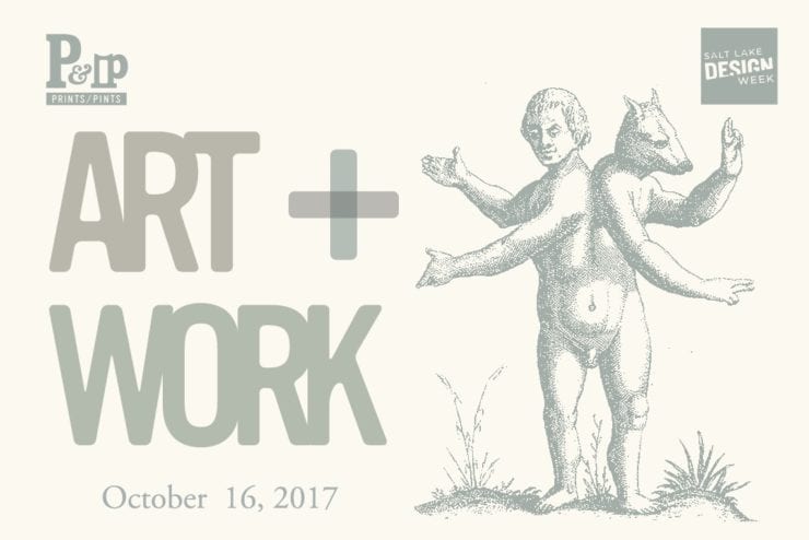
Art + Work, October 16, 2017, 7PM The Mandate Press and AIGA SLC is kicking off design week with our next Prints & Pints show. Exploring the place where art and business meet. Graphic design, architecture, advertising, environmental design, we could go on but you get it. These are…

Mandate Artist Print : Solar Eclipse

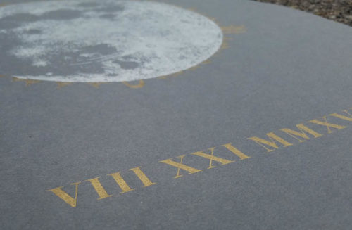
Mandate Artist Prints : Solar Eclipse We are all excited for the upcoming eclipse, so excited that we made a new, limited edition Solar Eclipse Print. It’s nicely sized for your wall at 18×24, and in a tasteful silver and gold ink, on 100# Neenah Environment Wrought Iron paper,…

Black Paper and Letterpress Printing

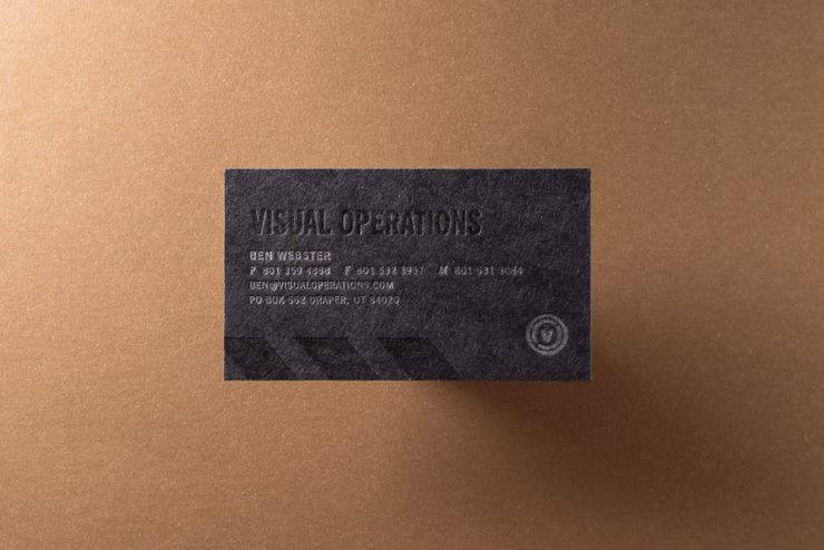
Black paper isn’t going out of style. The objective of this blog post is to help you design around the limitations of black paper. White paper is definitely the most frequently used paper color we see, but black is easily runner-up. Black paper does however, introduce some unique design…

Letterpress Terminology

As with most professions. Technical terms get thrown around a lot at the shop. So much so, that we tend to forget that it sounds like a foreign language to people that don’t work here. So in order to help decode some things we say, we have this here blog post…

The best price in town for letterpress? Actually… yes.

One stigma associated with letterpress printing: expensive. We actually hear this a lot. And compared to other printing methods it can appear expensive. But… it doesn’t have to be. And the objective of this blog post is not to give you a bunch of long-winded information about the value of…

Quit Not Using Holographic Foil

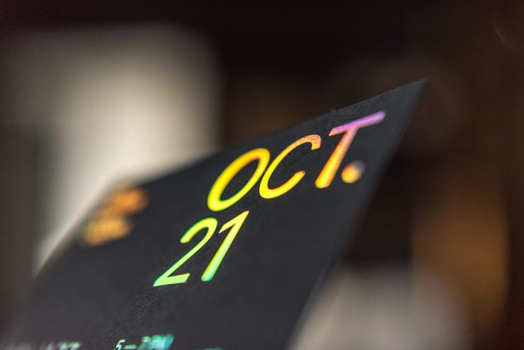
The world is full of color. Trust me on this… Just look around you. I am sick and tired of printing jobs that don’t utilize holographic foil. (That is a little bit of a lie. We print a lot of great shit that doesn’t have holographic foil on it. I am…

You’re Invited: Invite Advice.

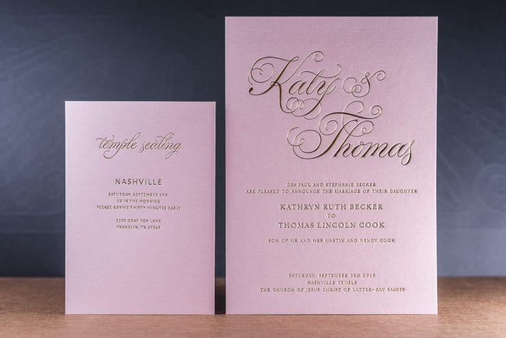
It is wedding season again. Which means we have the privilege of welcoming all you excited and nervous brides and grooms into the shop. I will leave the advice of living a healthy and blissful life as a married couple to your (what I assume are) delightful relatives. However, a few…

I Like You.

a·poc·ry·phal – of doubtful authenticity, although widely circulated as being true. There is this probably apocryphal story* about a car salesman in Michigan. He sent out 13,000 notecards a month to his clients that simply said “I like you”. He did this every month with a different design, and eventually became…